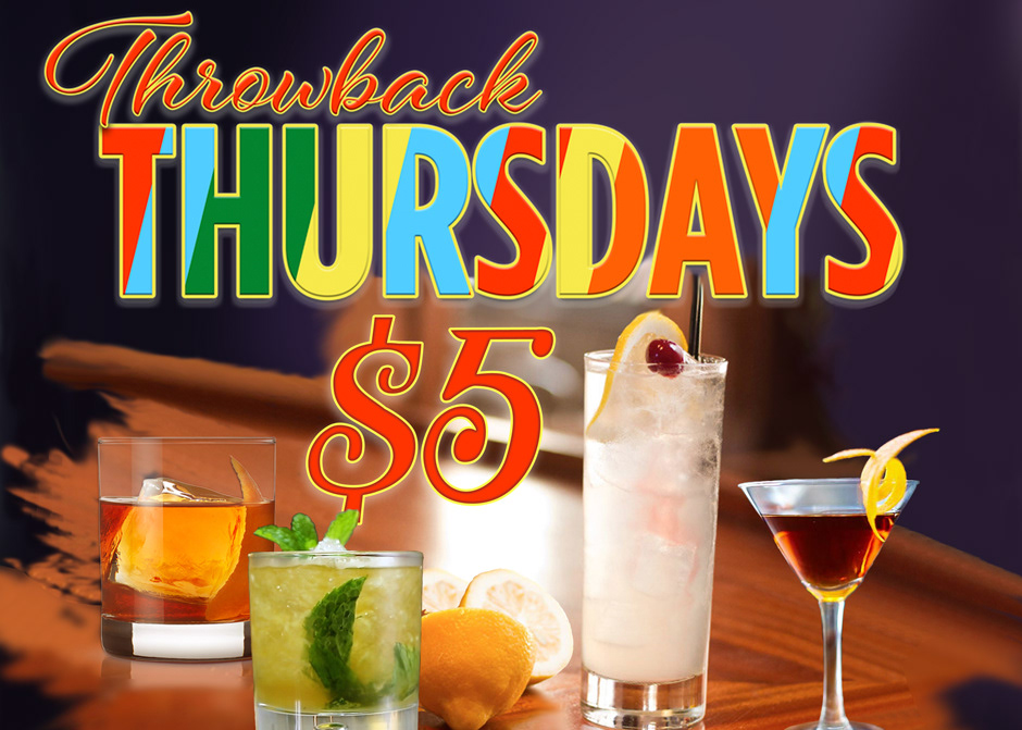
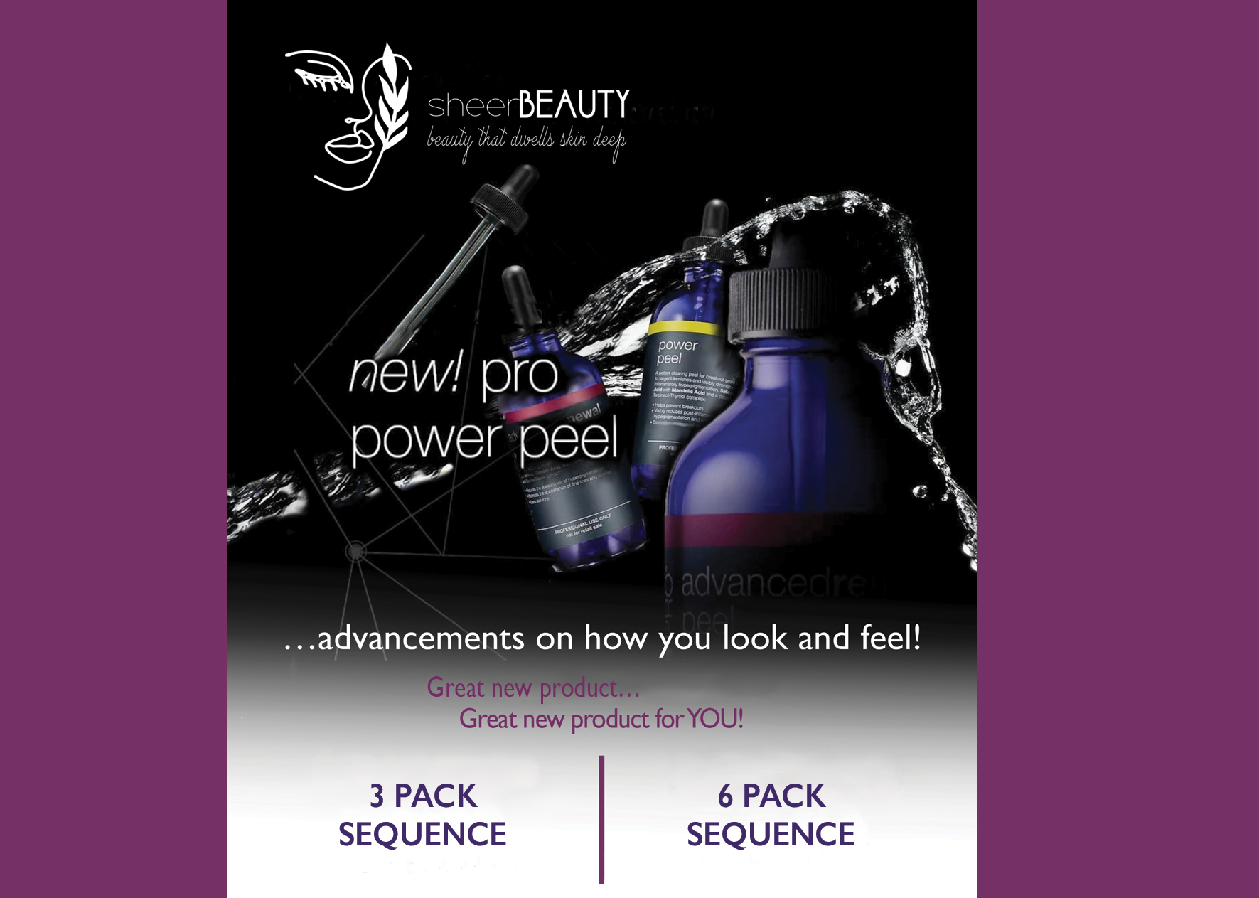
Magazines, Brochures, City Informational Bulk Mailers, Program Booklets, and Menu Boards. These are all developed, designed, and laid out from start to final printing, keeping in mind the client's needs and budget. Each requires a different frame of thought geared for its unique purpose and message. Creativity in the design layout is essential to its content. I believe a strong layout speaks for the piece itself. I use the elements in the piece to tie the whole layout together making each as unique in content as in context. I love to use color whenever possible, but I also find that using a monochromatic scheme works just as well depending on the piece and its application.
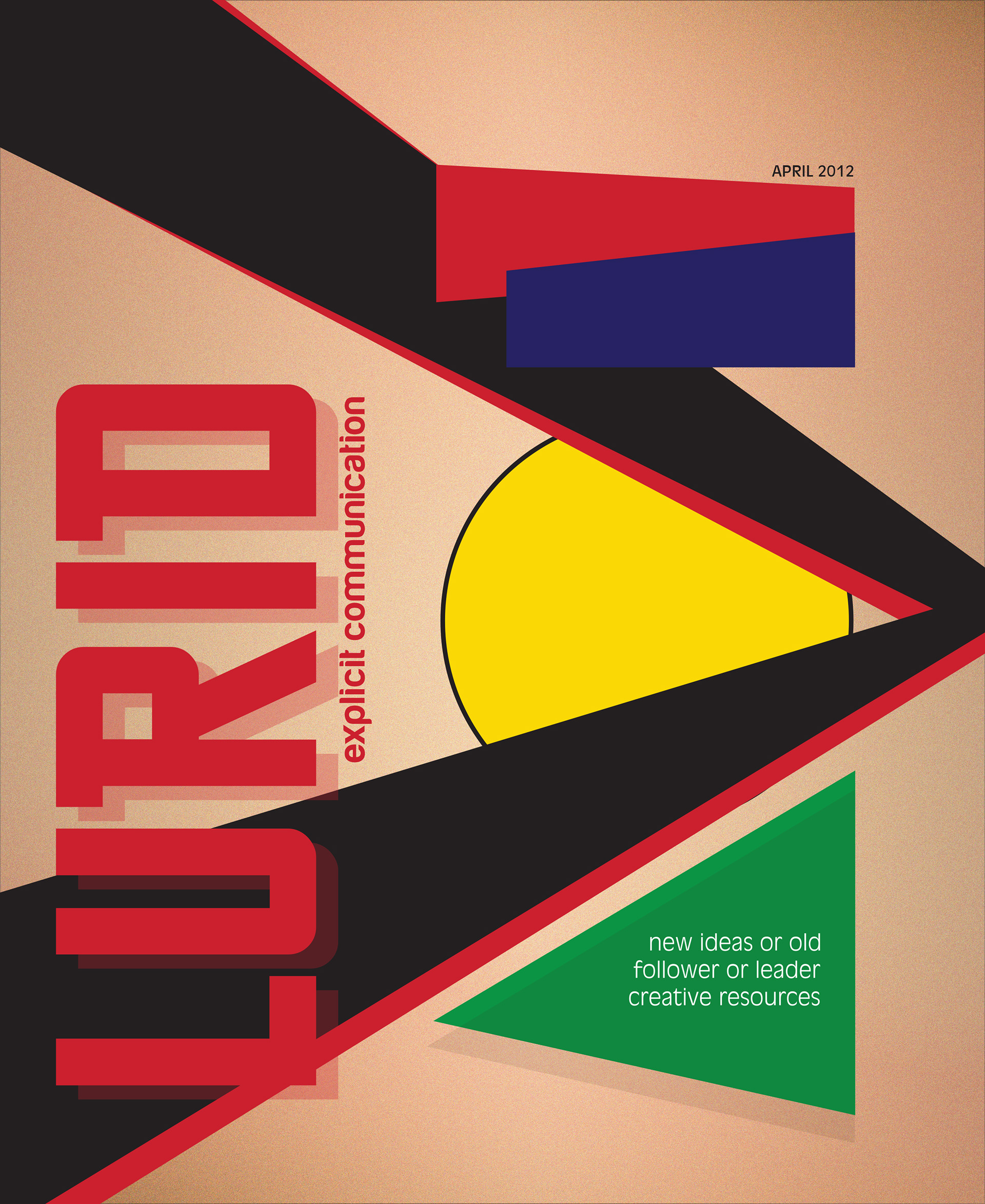
Lurid Magazine Layout project developed on the Bauhaus Movement and its design principals. I used the Bauhaus influence to create the cover and inside pages. Article was provided and used with written consent for layout purposes only.
Booklet developed for the National Guild of Piano Teachers. This organization is about helping young and old, whose love for music can be developed through the dedication and passion these teachers have. The theme was developed, designed, layed out, from start to finish based on the raw information they gave me. I developed all ads as they only gave me Word document information.
Zamek Polish Dancers are a Polish Dance Troop founded through the Polish Women's Alliance of America. Each year, they have a recital and crown their Queen. I have designed their program booklet for the past four years. Creativity and page layout is key in putting these books together so they deliver a strong presence so businesses will buy ads to help fund the book.
Legally Blonde Program Booklet: Designed and developed for Warren Woods Tower High School Drama Club. I designed the entire booklet based on the play. Fun and full of little puns from the story's theme. I had fun getting into the design of this one!
Hazel Park's Water Quality Report is an annual bulk mailer distributed throughout Hazel Park to its residents. This report informs of the water safety content and gives information on toxic/non-toxic levels, based on that year's reading. Every year, I've designed a different theme and use colors based on that theme. I've had the opportunity to develop and design this report for fourteen years.
A more simple and basic two sided tri-fold for this Florida based company. They requested a direct mailer delivering their experience, service and quality information to customers.

